Equator Coffees announces its new packaging design

Image: Equator Coffees
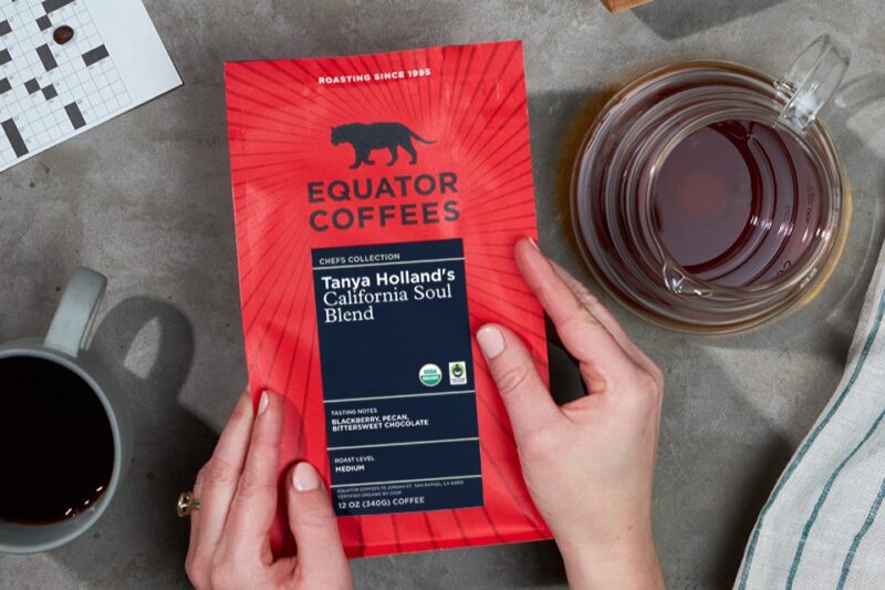
Equator Coffees has launched its new packaging design as it approaches its 30th year milestone in 2025. The company says its redesigned packaging pays homage to Equator’s legacy and sets the stage for its future with a renewed commitment to excellence.
The core packaging design features bold red, stark black, and sharp lines that the California, US-based company has used much in its branding previously. Central to the new design is the addition of sun rays emanating from the centre, symbolising “Equator’s sense of optimism and forward momentum,” according to the company.
“We wanted our new packaging to not only reflect our brand’s heritage but also convey our vision for the future,” said Shelby Colley, head of marketing at Equator Coffees. “The introduction of sun rays signifies our commitment to growth, innovation, and embracing what lies ahead as we enter our third decade and beyond.”
In addition to the visual updates, Equator Coffees has introduced a new colour system and label structure to provide customers with more information about each coffee variety. Inspired by the structure of a ledger, the redesigned labels utilise colour to differentiate between blends, single origins, espressos, decafs, and selections from the Chef’s Collection. Roast profiles and detailed variety and processing method information have also been added, catering to both seasoned coffee enthusiasts and newcomers alike.
The redesign was done in partnership with designer, Swasti Mittal, who helped shape the new packaging to align with the brand’s future direction.
“We are thrilled to have partnered with Swasti on this journey,” added Colley. “Her creativity and attention to detail were instrumental in bringing our vision to life, and we couldn’t be happier with the result.”
Equator Coffees’ new packaging design is now available across its product range.
For more information about Equator Coffees and its new packaging design, visit equatorcoffees.com.


