
Refreshed English Tea Shop branding highlights sustainability story
English Tea Shop has revealed a revitalised brand identity and packaging, created by design and innovation agency Echo.
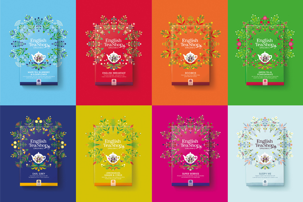
The new design delivers a consistent English Tea Shop look and feel across the 55 countries it trades in, as the company aims to deliver a unified brand behind a story of sustainability.
Since 2010, English Tea Shop has been working in collaboration with small organic farms in Sri Lanka and 20 other countries to source ingredients, grown without chemical fertilisers or pesticides. Its popularity has soared as people have fallen in love with both the quality of its teas and the provenance story behind them.
The company buys limited, sustainable quantities from each farmer, paying them a premium on top of the Fairtrade price, and works to improve the wellbeing of the farmers and their families. It’s also working towards full organic certification for its entire range of products.
CEO, Suranga Herath said: “Our brand has become synonymous with a taste and values that people want. We wanted to create a consistent visual identity across the globe, to help people recognise the products more easily, and during this process we’ve come to recognise that our farm-to-cup story is not simply an ethos we believe – it can become the unifying concept for the brand.”
Echo’s new designs tell English Tea Shop’s strong sustainability story and in-pack illustrations telling the brand’s farm-to-cup story.
“We chose those to reflect the Sri Lankan tradition of celebrating colour in all its glory,” said Nigel Ritchie, founding partner and creative director at Echo. “They build on strong established codes – for example, red for English breakfast tea, and dark blue for Earl Grey – adding bold combinations to highlight the rich ingredient combinations. The wellness range features slightly lighter colouring, indicating the more delicate flavouring of the range.”
Typography, copy and imagery all work together on these packs to deliver a clear sustainability story. The hand-drawn lettering of the brand mark has been refined to make it easier to read. On-pack wording is tighter and more direct, with more emphasis on the ingredients. Each pack also features a strapline summarising the brand story: Your Tea Loving Community.
The new teapot icon holds figures of a man and a woman nurturing tea plants, while mandala designs created by French illustrator Margaux Carpentier burst from the centre of the packs, celebrating each product’s organic ingredients. The new in-pack illustration shows an ocean connecting a farm and factory on one side, and an English tea shop on the other.
Herath concludes: “Our rebrand goes beyond revitalising our packaging; it changes how we communicate and connect with all our customers. Our commitment to celebrating communities from ‘farm to cup’ is absolutely central to who we are as a company, so it was very important to us that this comes across in our packaging and communications. That’s what Echo have delivered here and we can’t wait to show our new look and feel to our customers around the world.”
Initially this new brand and packaging design is rolling out across the 28 teas in the Your Everyday range, the 15 Your Super Goodness teas and the 11 teas in the Your Wellness Me range.